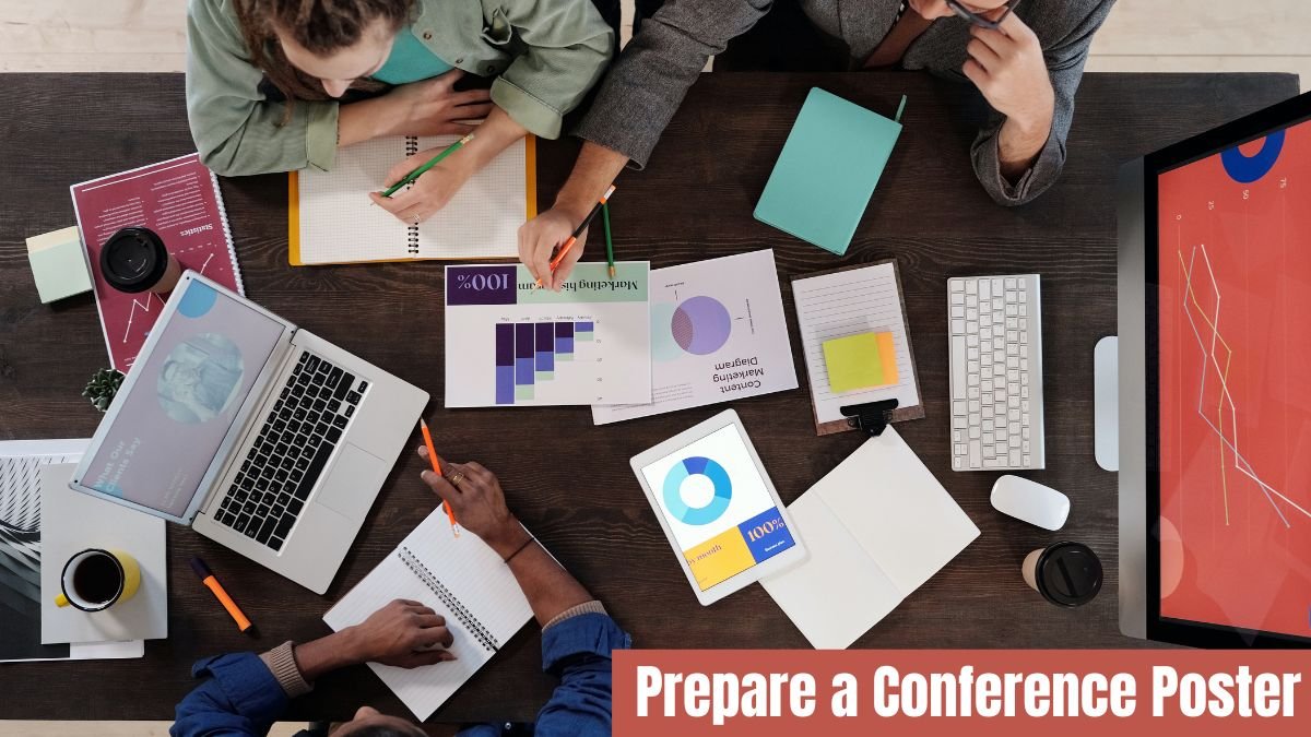
Academic conferences are exciting environments where researchers, students, and professionals gather to share ideas, present findings, and learn from one another. One of the most common and impactful ways to communicate your research at such events is through a conference poster. A well-crafted poster does far more than simply display data—it tells a story, sparks curiosity, invites discussion, and can even open doors to collaborations, internships, or future research opportunities.
But preparing a conference poster can seem intimidating if you’ve never done it before. How do you summarize months—or even years—of research into a single visual sheet? How do you ensure your poster is both informative and engaging? What design principles should you follow?
This guide walks you through each step of the process in a simple, practical, and human-friendly way. Whether you’re a student presenting your first poster or a professional refining your visual communication skills, this step-by-step approach will help you create a poster that stands out.
Understand the Purpose of a Conference Poster
Before you begin designing, it’s important to understand why conference posters exist. Unlike journal articles that dive deep into methodology and analyses, posters are meant to:
- Highlight the key aspects of your research
- Offer a quick, visual summary
- Support conversations with conference attendees
- Communicate your findings clearly and concisely
Think of your poster as an invitation—your goal is not to overwhelm people with details, but to attract them, engage them, and encourage meaningful discussion.
Know Your Audience and the Conference Guidelines
No two conferences are identical. Organizers often specify poster size, orientation (portrait or landscape), font size, color restrictions, and sometimes even template requirements.
Before you start working, review:
- Poster dimensions
- Layout specifications
- File format requirements (PDF, PNG, etc.)
- Printing instructions
- Mounting or presentation rules
In addition, think about your audience. Are they experts in your field or a general academic crowd? Your level of detail, technical language, and visuals should suit the people who will walk by your poster.
Create a Strong and Informative Title
Your poster title is the first thing people see—sometimes from several feet away. It should be catchy, clear, and descriptive. A good title communicates the essence of your research while sparking curiosity.
For example: Evaluating Machine Learning Models for Predicting Urban Heat Islands in Megacities
A strong title should:
- Reflect your central research question
- Be concise but informative
- Avoid unnecessary jargon
- Capture the reader’s interest
Place the title at the top center of the poster in large, bold fonts so it’s easy to read from a distance.
Structure Your Poster with a Clear Layout
A typical research poster follows a logical sequence similar to a scientific paper but much more condensed. Most posters use a three-column layout, but you can choose any structure as long as it is clean and easy to follow.
Common Sections to Include:
- Title, Authors, and Institutional Affiliations
- Abstract or Introduction
- Research Problem or Objective
- Methodology
- Results (Graphs, Tables, Images)
- Discussion or Interpretation
Write the Content Briefly but Powerfully
A poster is not the place for lengthy paragraphs. Instead, aim for clarity and brevity. Replace long sentences with short, impactful bullet points. Every sentence should serve a purpose.
Tips for writing poster text:
- Use bullet points, not paragraphs
- Be direct and factual
- Avoid jargon if possible
- Highlight key findings and insights
- Focus on what the viewer must know
Remember, people spend an average of 2–3 minutes reading a poster. Make those minutes count.
Use High-Quality Visuals to Tell Your Story
Visuals are the heart of a conference poster. Clear, well-designed visuals can communicate complex information quickly and effectively.
Common Visual Elements:
- Graphs and charts
- Tables
- Diagrams
- Flowcharts
- Photographs
- Illustrations
- Heat maps
- Infographics
- Make sure every visual is:
- High-resolution
- Clearly labeled
- Easy to interpret
- Matched with a short caption
Avoid clutter—too many visuals can confuse the viewer. Choose the most impactful ones that directly support your message.
Draft Your Poster in Design Software
Once your content and design plan are ready, draft your poster using software such as:
- PowerPoint
- Adobe Illustrator
- Canva
- Google Slides
- Inkscape
- LaTeX (Overleaf) for academic templates
PowerPoint remains the most popular tool because it’s simple, accessible, and offers customizable templates.
Tips While Designing Your Poster:
- Set your poster size before adding content
- Use rulers and gridlines for alignment
- Keep margins consistent
- Save versions frequently
- Zoom in to check clarity of text and visuals
When you’re happy with your layout, save your final poster as a high-resolution PDF, which is usually required by printing centers.
Review and Proofread Carefully
Spelling mistakes or formatting errors can make even the best research look unprofessional.
Before finalizing, check for:
- Grammar and spelling
- Alignment consistency
- Color accuracy
- Readability from a distance
- Clear labels and captions
Ask your supervisor, colleagues, or lab members to review your poster. Fresh eyes often catch mistakes you might overlook.
Add Final Touches to Enhance Professional Appearance
Depending on your field and conference, you may consider adding:
- Your lab or department logo
- Funding acknowledgments
- A QR code linking to your full paper
- Social media handles (LinkedIn, ResearchGate, ORCID)
- These small additions help establish your identity as a researcher and provide viewers with ways to connect.
Conclusion
Preparing a conference poster is a rewarding process. It pushes you to simplify your research, focus on what truly matters, and communicate your findings visually and effectively. A well-designed poster not only showcases your hard work but also opens doors to networking, collaboration, and recognition in the academic community.
By understanding your audience, organizing your content thoughtfully, using eye-catching visuals, and presenting with confidence, you can create a poster that stands out—even in a crowded conference hall.
Remember: your poster is a conversation starter. Keep it engaging, clear, and visually appealing, and you’ll leave a strong impression on everyone who stops by.
